
Wash and Glaze in Watercolor: Beginner Guide to Depth and Glow
Howdy y’all! Kirby here from Chatty Lobster Studio. A watercolor-loving Texas mama with paint on my jeans, a to-do list longer than I care to admit, and probably a snack plate for my kids sitting just out of reach. Today we’re diving into one of my absolute favorite topics in watercolor: wash and glaze. Whether you’re brand-new to watercolor or you’ve been slinging paint for years, these two techniques bring depth, richness, and those jaw-dropping “how did she do that?” moments. So grab your brushes, a comfy chair, and let’s talk about why washes and glazes will take your watercolor from flat to fabulous.
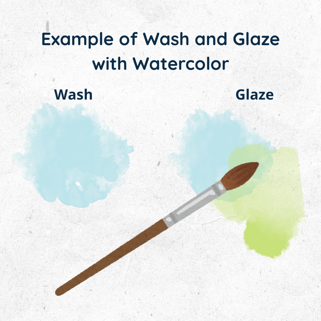
What Is a Wash in Watercolor?
A watercolor wash is a thin, even layer of diluted paint spread across the paper to create a smooth background or base.
Types of watercolor washes:
- Flat Wash: One solid, even color.
- Graded Wash: Starts dark, fades to light.
- Variegated Wash: Two or more colors blending like a Texas sunset.
For the best watercolor paper for smooth washes, try Arches Cold Press 140 lb (https://amzn.to/4nbDiU7). It won’t buckle or ripple like cheaper pads.
What Is a Glaze in Watercolor?
A watercolor glaze is a transparent wash painted over a dry layer of color to adjust, enrich, or deepen it without covering it up.
- Always use transparent colors for glazing.
- Glazes let the base layer shine through, creating luminous depth.
- They’re perfect for adjusting tone, shadow, or warmth.
For the best transparent watercolors for glazing, I recommend Daniel Smith Extra Fine Watercolors (https://amzn.to/4psroXp). They’re professional-grade and glow beautifully.
What’s the Difference Between Wash and Glaze?
- Wash = foundation layer on paper.
- Glaze = transparent layer on top of existing paint.
- A wash sets the scene. A glaze fine-tunes the mood.
Think of it like stained glass: the wash is the clear panel, and the glaze is the colored overlay that shifts the light and creates that glowing effect without hiding what’s underneath.
Do You Let Watercolors Dry Between Layers?
Yes, absolutely. For glazing to work, the first layer must be completely dry. If it’s damp, the colors bleed together and turn muddy.
A mini heat tool for watercolor drying (https://amzn.to/46v00PW) can save you time so you’re not stuck staring at wet paper.
What Happens When You Glaze Over a Wash?
When you apply a glaze over a wash, the two layers interact. The transparent top layer tints and enriches the bottom one, creating new colors and depth.
It’s the same magic as stained glass, the base wash is your panel, and the glaze is that luminous overlay that transforms plain light into glowing color.
Example: A yellow glaze over a blue wash creates a glowing green that feels more alive than straight-from-the-tube green.
How Many Layers of Watercolor Can You Do?
On lower quality paper, 2–3 layers before the surface gives out. On professional paper, you can do 5–6 or more glazes without trouble.
For multiple layers of watercolor, I recommend Canson XL Watercolor Pads (https://amzn.to/4mkyScg) for budget-friendly practice, or Arches Cold Press Blocks (https://amzn.to/46G4Sml) for professional results.
Three Common Mistakes in Washes & Glazes
- Not letting the paper dry fully. Leads to mud.
- Using opaque colors for glazing. Blocks the glow.
- Scrubbing the surface. Damages your paper.
A soft round brush like this watercolor brush set (https://amzn.to/46ocLvt) will help you apply washes and glazes smoothly without tearing up your paper.
Best Colors for Wash and Glaze in Watercolor
The most effective glazing colors are transparent pigments that layer without blocking the light underneath. If you’re working from the Daniel Smith Essentials Set, here are the best choices:
- Hansa Yellow Light – crisp and transparent, perfect for glowing sunny glazes
- Quinacridone Rose – a beautiful transparent pink that layers into luminous florals or warm shadows
- Phthalo Blue (Green Shade) – transparent, bold, and perfect for glazing into vibrant greens
- French Ultramarine – slightly granulating but still transparent enough to glaze depth into skies and shadows
The Daniel Smith Essentials Set ((https://amzn.to/4psroXp) includes all of these colors, making it a fantastic all-in-one starting palette for practicing both washes and glazes.
Watercolor Glazing Recipes
Want to see how these colors interact? Here are a few favorite glazing combos straight from the Essentials Set:
- Hansa Yellow Light + Phthalo Blue (GS) → Glowing Green
- Quinacridone Rose + Phthalo Blue (GS) → Vibrant Violet
- Hansa Yellow Light + Quinacridone Rose → Warm Orange
- French Ultramarine + Quinacridone Rose → Deep Violet Shadows
Here’s a quick reference card you can save or pin:
(Insert your branded “Glazing Recipe” infographic with color swatches and Chatty Lobster Studio logo here.)
Why Do Artists Use Washes and Glazes?
Artists use washes to create smooth foundations and glazes to enhance richness, depth, and luminosity. Together, they work like stained glass — the base wash provides structure, and the transparent glaze transforms it with glowing color and atmosphere.
If you’re learning wash and glaze in watercolor, remember that washes set the tone while glazes add depth. Even beginners can use these techniques to instantly improve their work. A simple flat wash with a transparent glaze over it will show you the glow right away.
Your Wash & Glaze Starter Pack
Here’s what I’d grab if you’re just starting or want to level up:
- Daniel Smith Transparent Watercolors (https://amzn.to/4psroXp) — best paints for glazing
- Arches Cold Press Watercolor Paper (https://amzn.to/4nbDiU7)— holds multiple washes/layers
- Round Brush Set for Watercolor (https://amzn.to/46ocLvt) — smooth applications
- Ceramic Mixing Palette (https://amzn.to/3K5IcmW) — keeps colors clean & separate
FAQ: Washes & Glazes in Watercolor
What’s the difference between layering and glazing?
Layering simply means painting one color on top of another once it’s dry. Glazing is a type of layering, but specifically with transparent colors so the bottom layer shows through — like stained glass.
Can you glaze with opaque watercolors?
Not really. Opaque colors will cover up the layer underneath instead of letting it shine through. Stick with transparent pigments for glazing.
Is glazing the same as underpainting?
Nope! Underpainting is your very first base layer that sets the mood or tone. Glazing happens later — over dry layers — to adjust or enrich the color.
How many layers of glazing can I do?
As many as your paper will handle. Good quality watercolor paper can take 5–6 glazes easily. Cheaper paper usually gives up after 2–3.
What’s the best watercolor paper for glazing?
Heavier papers (140 lb and up) work best. Arches Cold Press (affiliate) is my go-to because it holds up beautifully to multiple glazes.
Wrap Up
So there you have it! A wash lays the groundwork, a glaze adds the glow. Together, they’re simple to learn, fun to experiment with, and powerful enough to transform your watercolor art.
Next time you paint, try a flat wash, let it dry, and add a transparent glaze. Watch how it transforms your painting into something luminous and layered — just like light shining through stained glass.
Affiliate Disclosure
As an Amazon Associate, I earn from qualifying purchases. The product links above are affiliate links, which means I may receive a small commission (at no extra cost to you) if you decide to make a purchase. These commissions help me support art supplies and prizes for our watercolor group — a community that inspires others to paint, play, and create with joy!